在 React app 實作拖曳上傳區塊(drag and drop file uploader)
如題,之後的專案可能會用到這類元件,趁有空時搓一個練手感。成品與全部原始碼請參考這裡。
實作思路
關於 DragAndDrop.tsx
import { useState } from 'react';
import cn from 'classnames';
import './DragAndDrop.css';

type Props = {
  onUploadFile: (files: FileList) => void;
};

function DragAndDrop({ onUploadFile }: Props) {
  /* State */
  const [isHighlight, setIsHighlight] = useState<boolean>(false);

  /* Function */
  const handleDrop = (e: React.DragEvent<HTMLDivElement>) => {
    e.preventDefault(); // Prevent navigation.
    setIsHighlight(false);
    onUploadFile(e.dataTransfer.files);
  };
  const handleDragEnter = (e: React.DragEvent<HTMLDivElement>) => {
    e.preventDefault(); // Prevent navigation.
    setIsHighlight(true);
  };
  const handleDragOver = (e: React.DragEvent<HTMLDivElement>) => {
    e.preventDefault(); // Prevent navigation.
    setIsHighlight(true);
  };
  const handleDragLeave = (e: React.DragEvent<HTMLDivElement>) => {
    e.preventDefault(); // Prevent navigation.
    setIsHighlight(false);
  };

  /* Main */
  return (
    <div
      onDrop={handleDrop}
      onDragEnter={handleDragEnter}
      onDragOver={handleDragOver}
      onDragLeave={handleDragLeave}
      className={cn(
        'DragAndDrop_dropZone',
        isHighlight && 'DragAndDrop_highlight'
      )}
    >
      <p>Drag and drop the files here</p>
    </div>
  );
}

export default DragAndDrop;
這個元件最重要的任務就是透過 Html5 的 Drag and Drop Api 來判斷「使用者是否已經將檔案拖進有效區域」(即 css .DragAndDrop_dropZone 標記起來的元件)。若「有」則透過 css .DragAndDrop_highlight 來變化元件外觀,提示使用者可以放手(讓檔案落下)。
至於使用者丟進來的檔案要如何處理,則全部交給 props.onUploadFile 來負責。
關於樣式控制:兩組 css 命名的原則是「元件名稱+區塊意圖」,目的是盡量降低樣式撞名的機率。工程師可自行決定要在 app 的全域樣式檔案中處理此元件的樣式:
.DragAndDrop_dropZone {
  border: 2px dashed #ccc;
  /* 下略 */
}
或是由每一個引用此元件的親元件透過 css module 來管理外觀:
:local(.parent_class) :global(.DragAndDrop_dropZone) {
  background-color: navy;
  /* 下略 */
}
關於 App.tsx
import { useState, useRef } from 'react';
import Container from './Container';
import DragAndDrop from './DragAndDrop';
import classes from './App.module.css';
function App() {
/* State */
const [files, setFiles] = useState<File[]>([]);
const [errors, setErrors] = useState<File[]>([]);
const dialogRef = useRef<HTMLDialogElement | null>(null);
/* Function */
const onOpenDialog = (error: File[]) => {
if (!error.length) return;
setErrors(error);
dialogRef.current?.showModal();
};
const onCloseDialog = () => {
dialogRef.current?.close();
setErrors([]);
};
// do whatever you want with the files
const onUploadFile = (files: FileList) => {
const result: File[] = [];
const error: File[] = [];
for (const f of files) {
// for example, only accept png files
if (f.type === 'image/png') {
result.push(f);
} else {
error.push(f);
}
}
setFiles(result);
onOpenDialog(error);
};
const onDeleteFile = (index: number) => {
setFiles((prevFiles) => {
const newFiles = [...prevFiles];
newFiles.splice(index, 1);
return newFiles;
});
};
/* Main */
return (
<section className={classes.wrapper}>
<Container>
<h1>React drag and drop file uploader demo</h1>
<DragAndDrop onUploadFile={onUploadFile} />
{files.length > 0 && (
<ul>
{files.map((file, i) => (
<li key={i}>
{file.name}
<button onClick={() => onDeleteFile(i)}>Delete</button>
</li>
))}
</ul>
)}
</Container>
<dialog ref={dialogRef}>
<p>Following files are not upload:</p>
<ul>
{errors.map((err, i) => (
<li key={i}>{err.name}</li>
))}
</ul>
<button onClick={onCloseDialog}>close</button>
</dialog>
</section>
);
}
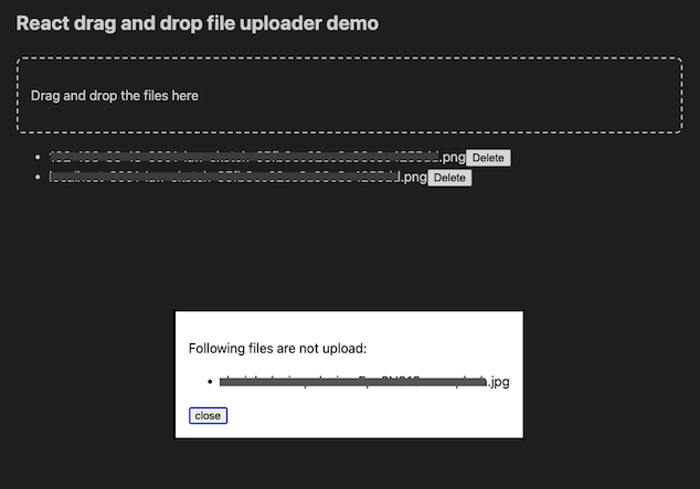
export default App;重點:透過 onUploadFile 來判斷允許上傳的檔案。以本篇範例而言,上傳規則就是「僅能使用 image/png 但不限制檔案數量。而當使用者提供了 png 以外的格式時,跳出對話框提示使用者哪些檔案沒有被採納」。可參考下方畫面截圖:
負責記錄檔案的局部變數 files 可根據規格需求拿去做二次加工,或是拿去打 api 等等⋯⋯。
搞定 🔨