總結
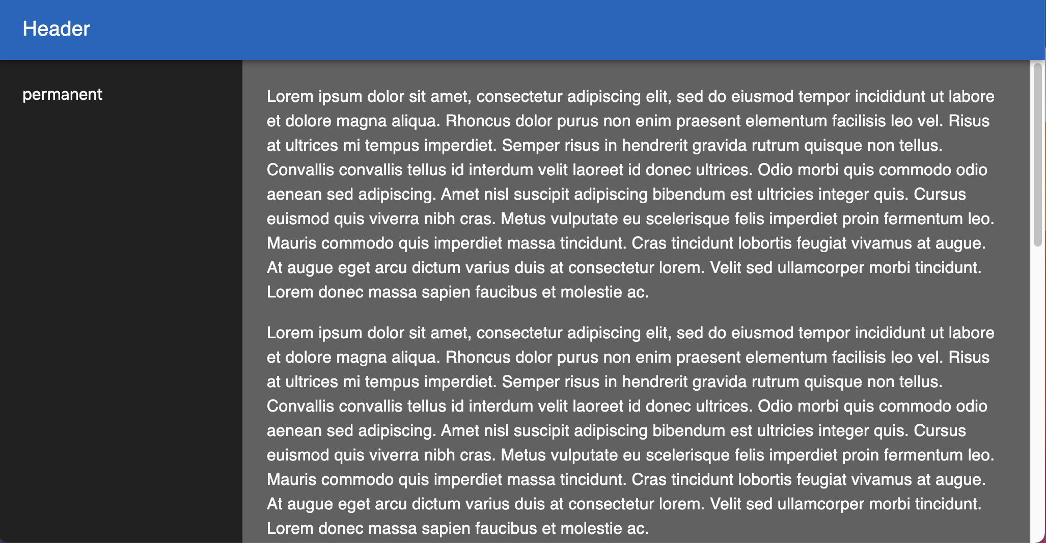
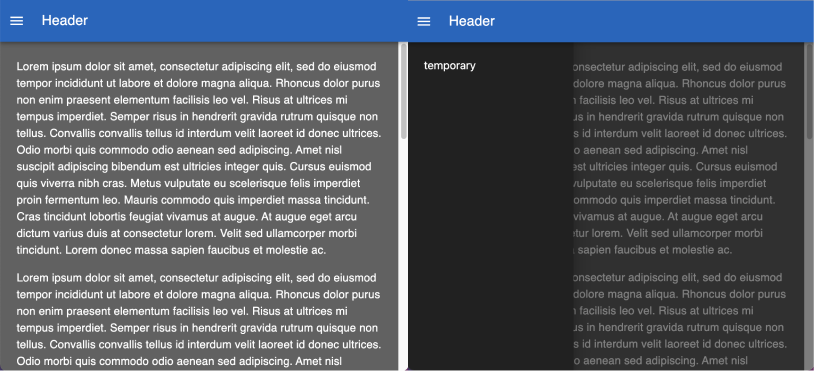
使用 permanent drawer 做出雙欄位效果,並在瀏覽器進入窄版時切換為 temporary drawer
版本與環境
@mui/material: 5.5.2筆記
Mui 的三種 Drawer
- Permanent navigation drawers are always visible and pinned to the left edge, at the same elevation as the content or background. They cannot be closed. 無法被關閉的 drawer
- Persistent navigation drawers can toggle open or closed. It is closed by default and opens by selecting the menu icon, and stays open until closed by the user. 可以經由使用者手動被關閉的 drawer
- Temporary navigation drawers can toggle open or closed. Closed by default, the drawer opens temporarily above all other content until a section is selected. 在 drawer 被開啟後,只要使用者點選其他部位,就會自動關閉 drawer
useMediaQuery
- 回傳的是目前畫面是否大於某 breakpoint 的 boolean 值
- 若要搭配 MUI 的 theme.breakpoints 來使用,有以下兩種寫法:
- 透過
useTheme取得 theme instance 後,將 theme 傳入useMediaQuery中 - 不需呼叫
useTheme而是直接傳入一組 callback function(theme) => theme.breakpoints.up('sm')進入useMediaQuery
- 透過
overflowY
- 若希望 scrollbar 出現在右側欄位內,則最外層的 container 需設定
height: 100vh並overflowY: hidden;並在右側欄位的 container 設定overflowY: auto - 在沒有透過
overflowY指定 scrollbar 前,若右側欄位的內容超過瀏覽器視區高度,則 scrollbar 會出現在整個視區的右側(包括 headerBar),而不是僅出現在右側欄位內