功能
當 flex item 被容器遮蔽時,強制讓排版呈現 start 的效果,確保 flex item 必定能被看見。
If the item overflows the alignment container, then the item is aligned as if the alignment mode is
start. The desired alignment will not be implemented.
要解決的問題
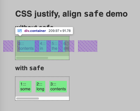
flex item 其中一種被遮蔽的原因是「容器寬高限制」。比如改編自 Safe/unsafe alignment in CSS flexbox 的這個範例,我寫死了兩個 div.container 的寬,又設定了 justify-content: center——這導致我們無法在第一個 div 看見第一、二個 flex item,即使滾動捲軸(scroll bar)也不行。
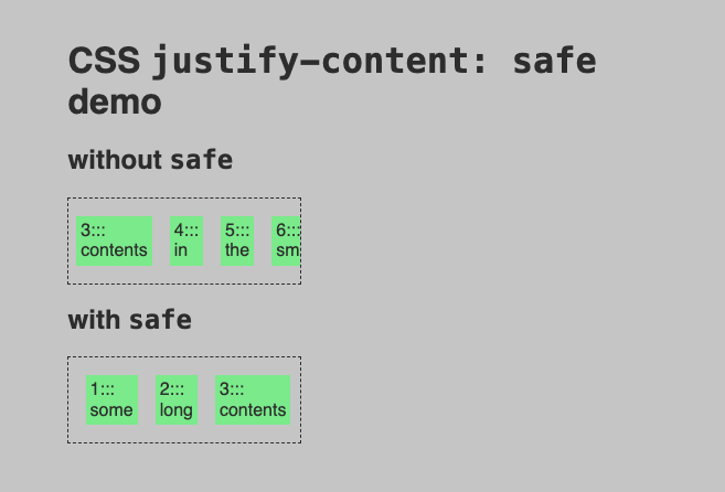
如果開啟 Chrome 的開發者模式,就會看到序列ㄧ、二的 flex item 在「容器設定為 justify-content: center 且寬度不足的情況下」會被完全遮蔽,即使滾動捲軸也看不到:
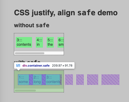
但如果將容器設定為 justify-content: safe center,在同樣寫死寬度的情況下,我只要滾動捲軸就能看到所有的子項目:
使用方式
要搭配排版關鍵字(alignment keyword)使用:
justify-content: safe center;以上範例翻譯為白話文即是:預設使用 justify-content: center 排版,但當容器中的項目會被擋住時,改為呈現 justify-content: start 的排版效果。
justify-* 與 align-* 系列的排版屬性都可使用此關鍵字。
關於支援度:目前在 Can I use 上沒有找到相關資料,但 Safari 18 — what web features are usable across browsers? 一文表示此功能在主流瀏覽器已全面綠燈。